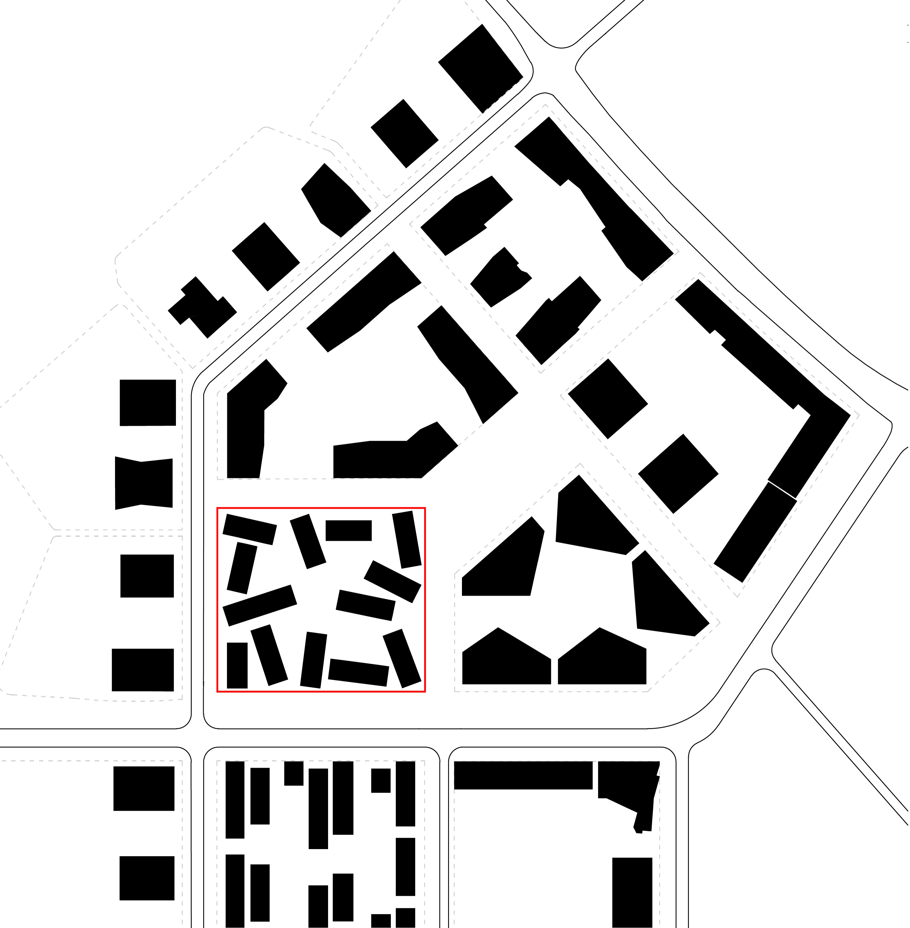
As a possible response to the dawning of a new „gründerzeit“ age, Aspern will see the creation of a new city covering 240 hectares including a lake for 20,000 residents and 20,000 working people within the next twenty years. One logical reason for this is that people can reach the city centres of Vienna and Bratislava in just 15 minutes. Naturally, such an undertaking requires strong identification points right from the start, and architecture can contribute hugely in that sense. This is where Slim City comes in. Thirteen slender towers of different heights form a unique and independent quarter on the construction site – a City in the city, as it were. Open urban space lavishly spread between the buildings is something that is more common in cities that have grown over time: a series of different plazas and constrictions – similar, yet varied, public, yet also used privately – which people can just walk through or use in many different ways. Although precisely calculated, these buildings appear to have grown by chance. They form units comprising 2 to 3 buildings linked together by exterior elevated walkways, which have the same address as the street from which they are accessible from. Consisting of 178 dwellings in all, these buildings obey a whole canon of formative rules. While standard floor plans prevail as long as external conditions remain more or less the same, new circumstances require an immediate response in the form of new floor plans. The ground floor gradually becomes a space for general use, instead of just for living purposes by introducing unusual living designs, small offices, commercial street use, a cafeteria-cum-party basement and a spacious community room with FM services.
Slim City
Slim City
Slim City
Slim City
| Year | 2015 | |
| CLient | EGW Heimstätte Ges.m.b.H | |
| Size | 15900 m² | |
| Place | Vienna | |
| Cost | EUR 16.900.000,- | |
| Excerpt | Residential towers densely packed: 178 flats with communal spaces, commercial and office areas, and bars/restaurants |

>>View Project

By loading the video, you agree to Vimeo's privacy policy.
Learn more
A network of interspaces
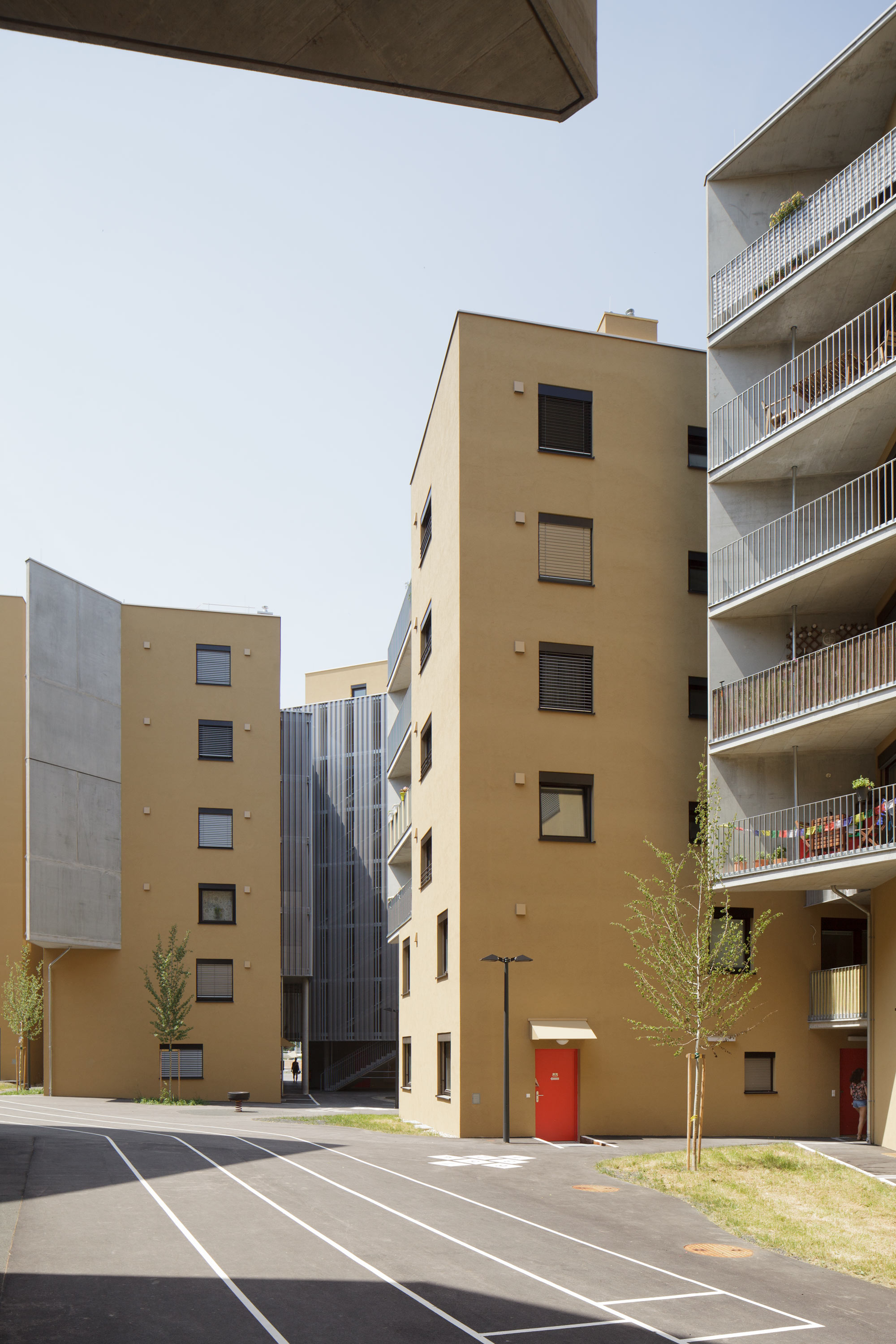
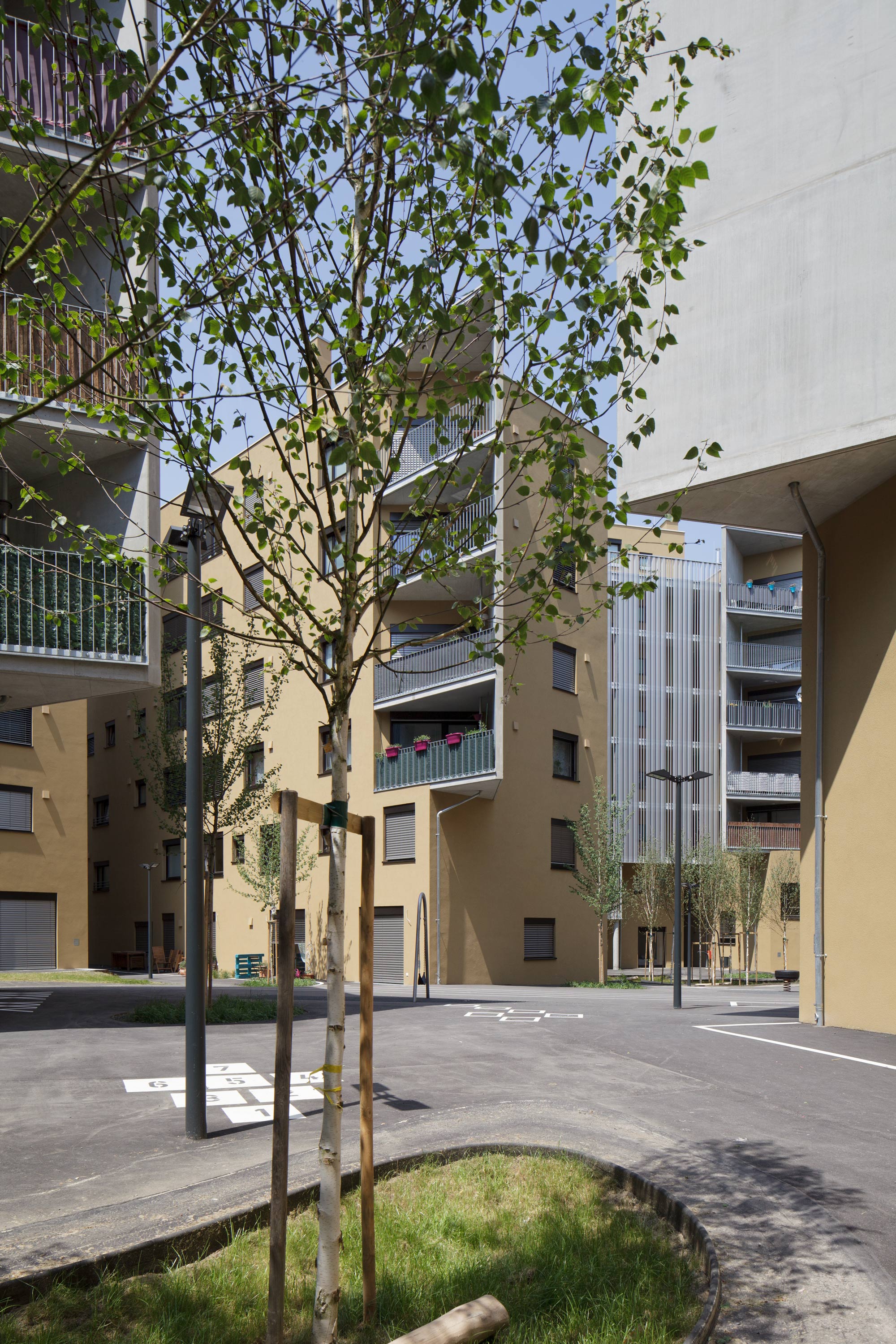
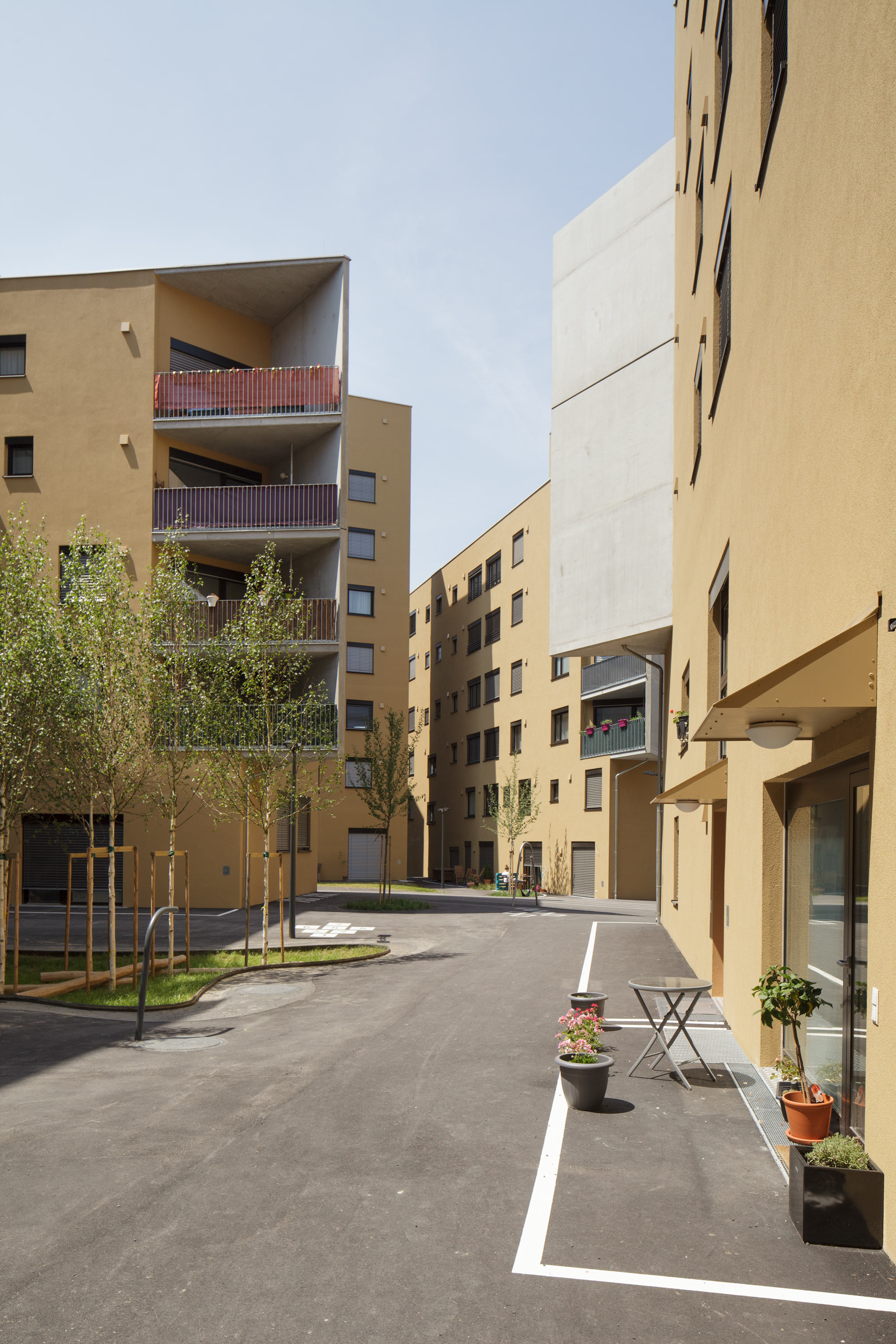
The linking of public spaces (streets, pavements and the quarter’s plaza) takes place via differentiated transitions. The whole zone is freely accessible. As a space for all generations and users, the ground floor area combines playgrounds for children of all ages and youngsters, as well as recreation areas for adults. We consciously designed overlapping usable areas as an interface where people can get together, thus stimulating communication between different social groups: a ball rolling towards an elderly lady sitting on a bench, for instance, will probably prompt her to strike up a conversation with the little boy. Ground markings initiate uses and help to distinguish between public space and private terraces. Most of the ground is tarmacked due to the many decentralised entrances on the ground floor and pioneering Seestadt City’s almost demonstrative urbanity. Staged percolation areas where puddles will form during heavy showers and fresh greenery can sprout out of gaps, were the focus of the landscape planning.

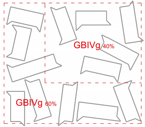
Block structure
To us, the perimeter block development specified in the master plan seemed too hermetic for a new city with an alternative, quasi car-free, mobility concept. Therefore, in the framework of the zoning procedure, we opened up block structures and made them permeable from all sides. However, the edge of the street area is visible because, in spite of its porosity, the quarter clearly produces an inside and outside.
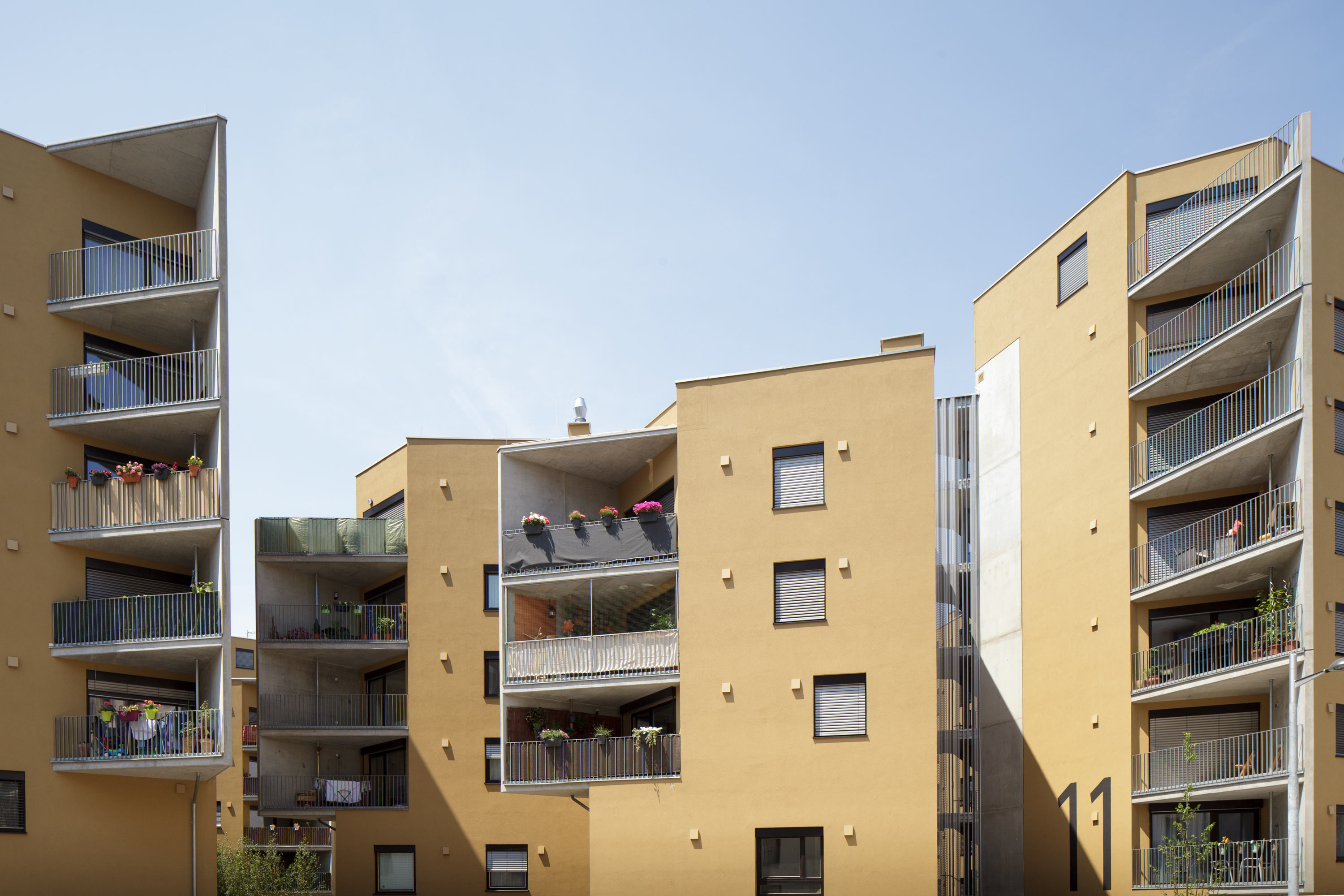
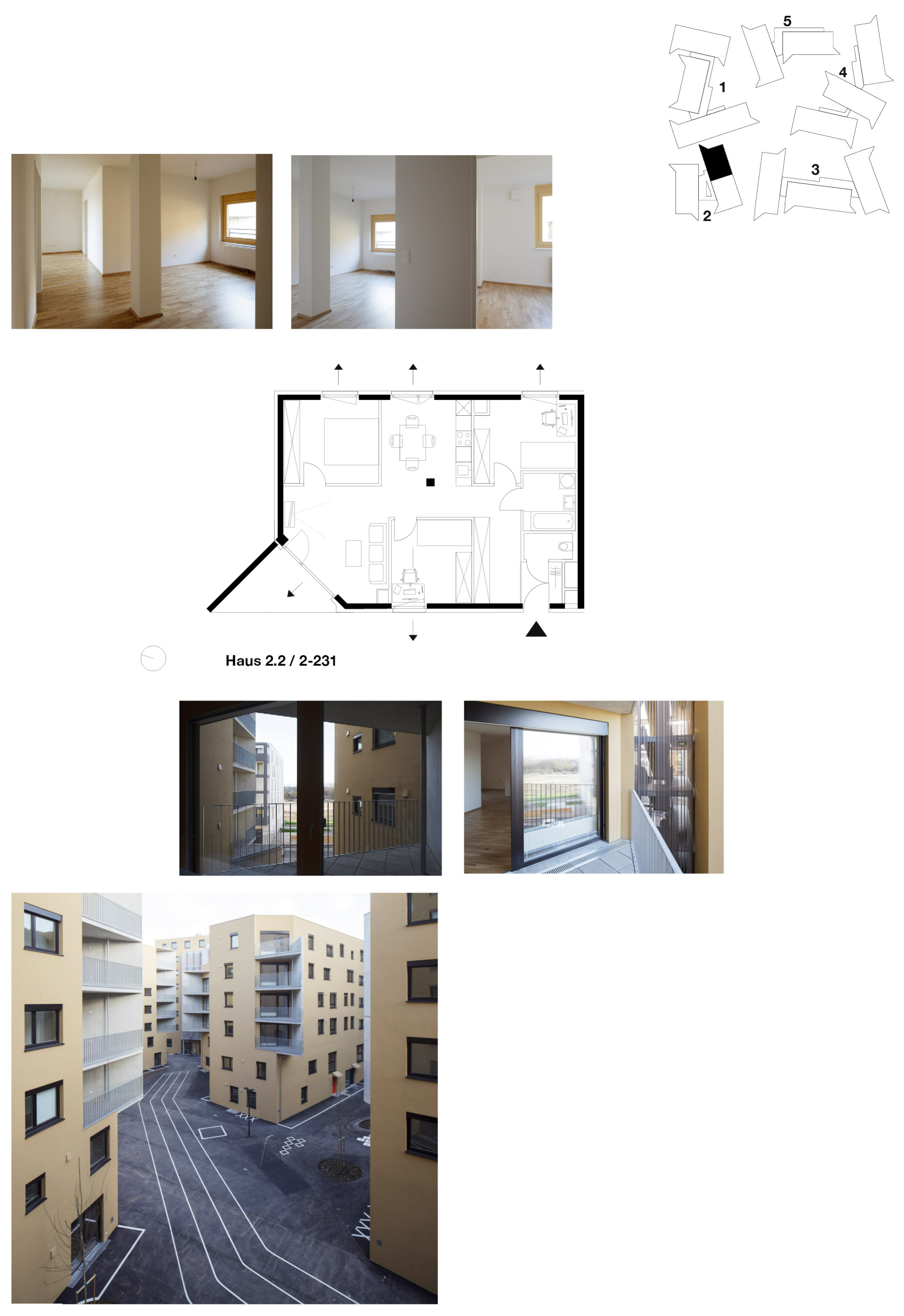
Accessibility Two to three apartment blocks are accessible via each exterior elevated walkways. They can also be accessed by an external staircase and a lift integrated in one of the buildings. In order to protect the walkways from driving rain and snow, we covered them (like a curtain that does not seem transparent on the outside, yet is extremely transparent on the inside – and vice versa at night) with perforated profiled sheeting (50% perforation as a minimum), spanning from ceiling to ceiling without using a substructure . These jointly accessible groups of buildings are numbered from House 1 to House 5. Each group possesses a clearly perceivable entrance from the street. Their accessibility is extremely economical, with only five lifts serving 178 units. In some apartment blocks, up to nine apartments per floor are accessible via just one staircase and one lift.
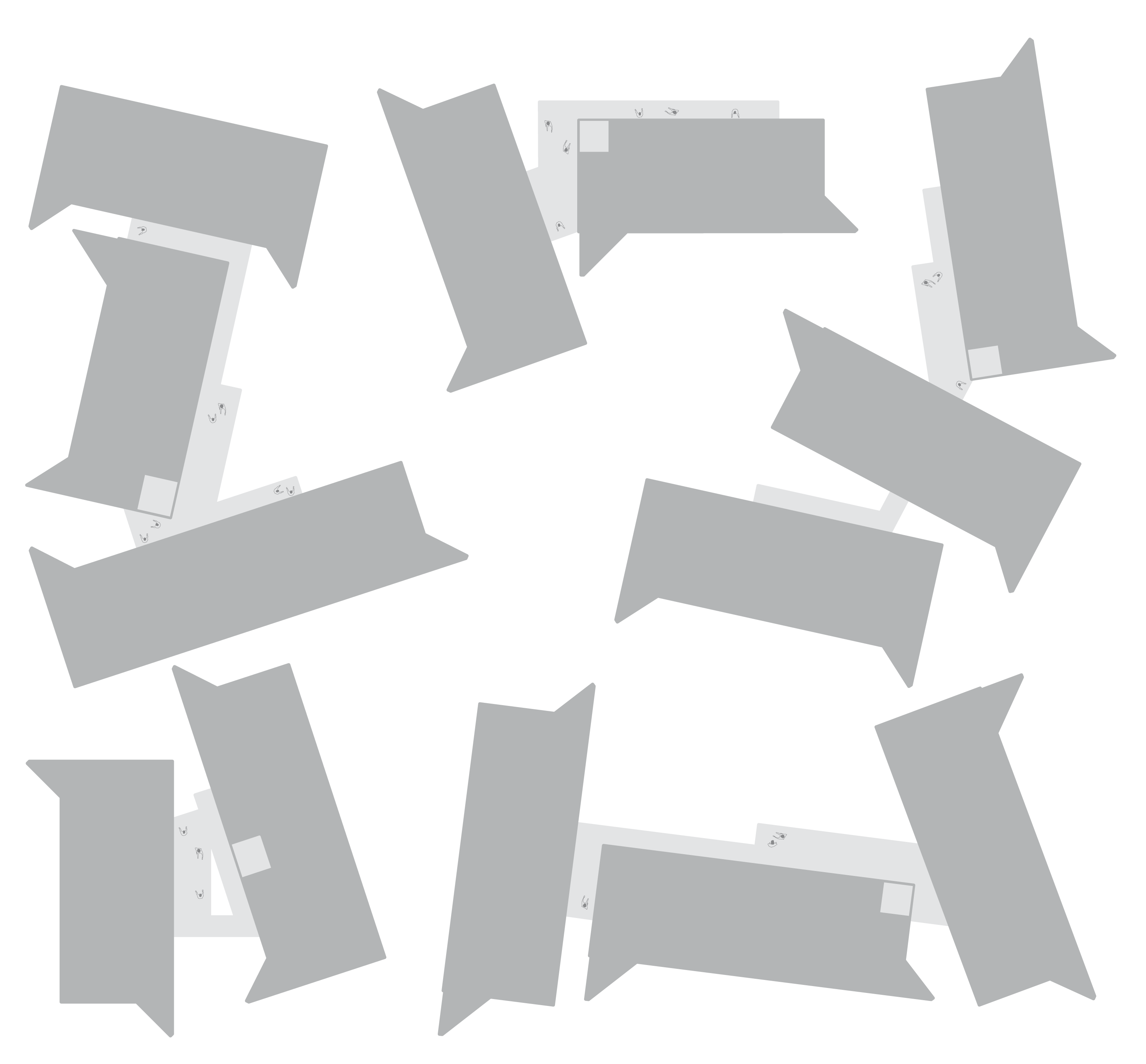
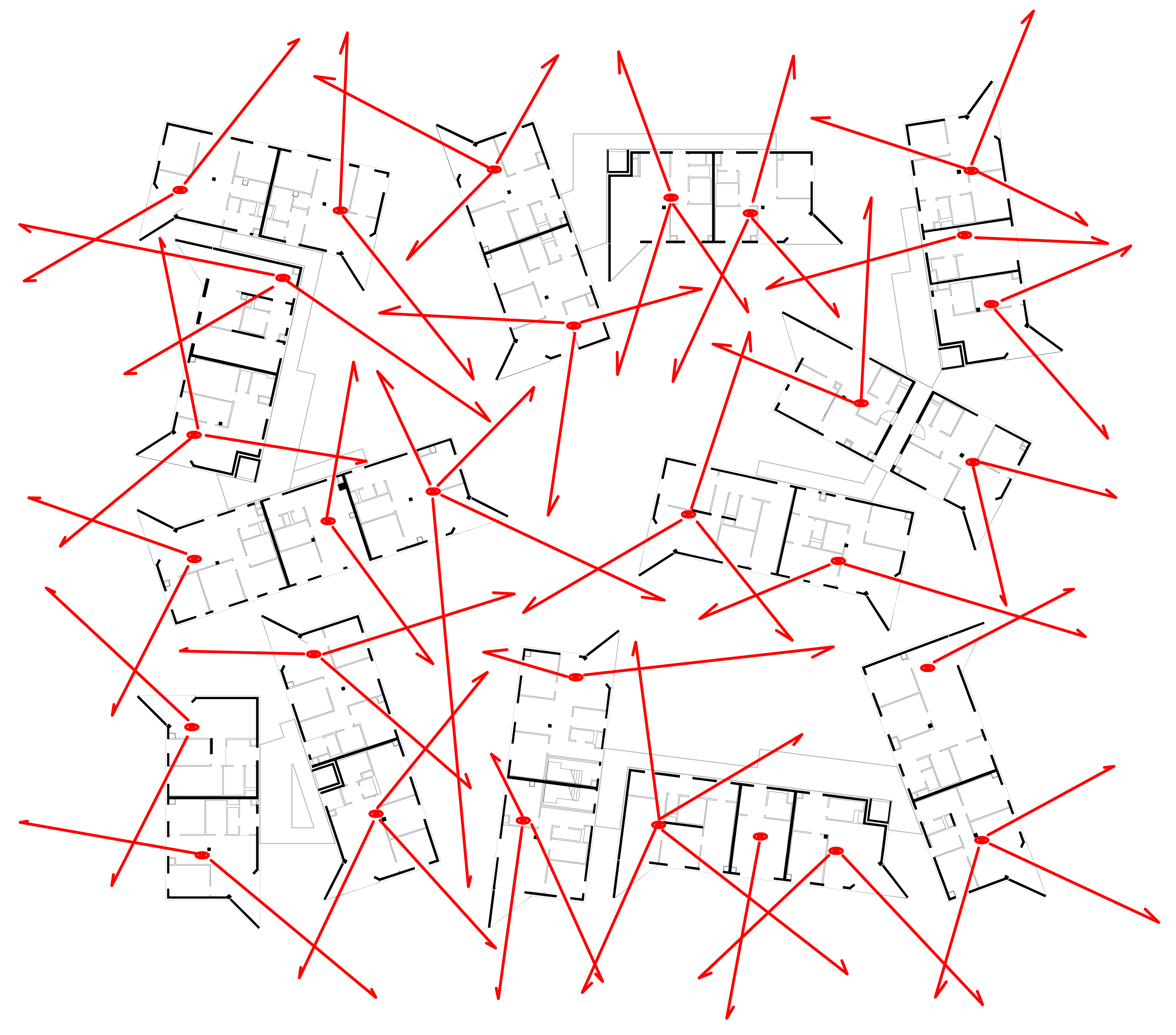
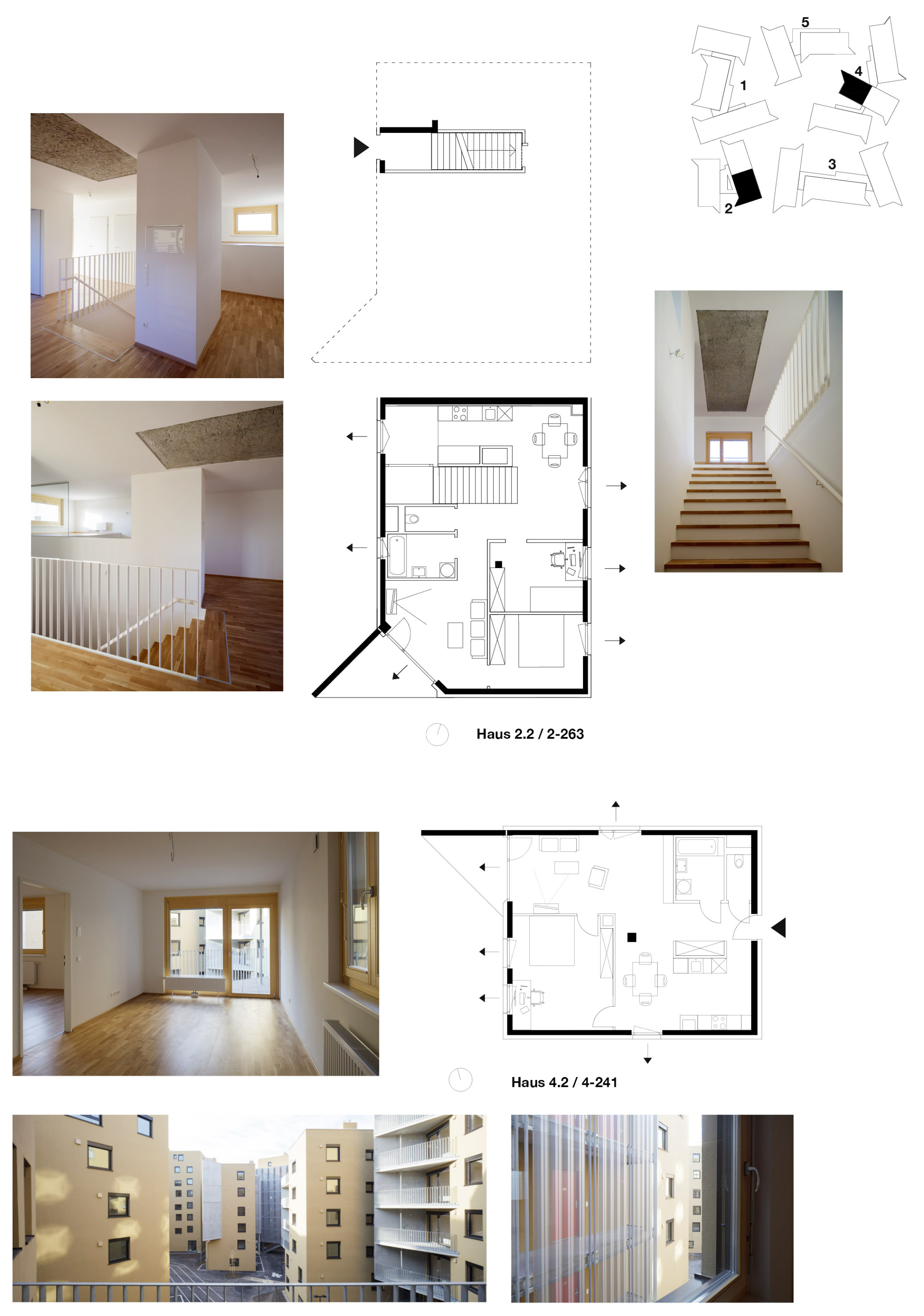
Viewing algorithms of the units Such a density is only possible if the houses have an appropriate inner life: As a rule, these 13 tower blocks contain two units per floor. Nearly all units are triple-aspect, thus offering views in different directions and situations. Each apartment boasts at least one vista. While each single building’s position will determine how near or far people can see, or whether they overlook a little plaza or not, their overall arrangement prevents residents from overlooking their neighbours to an unusual or interfering extent. Windows: window positions and dimensions follow an algorithm of brightness, with a tendency to diminish in size from bottom to top, as well as a viewing algorithm, with a tendency to increase in numbers from bottom to top. Accordingly, each floor has differently arranged windows.
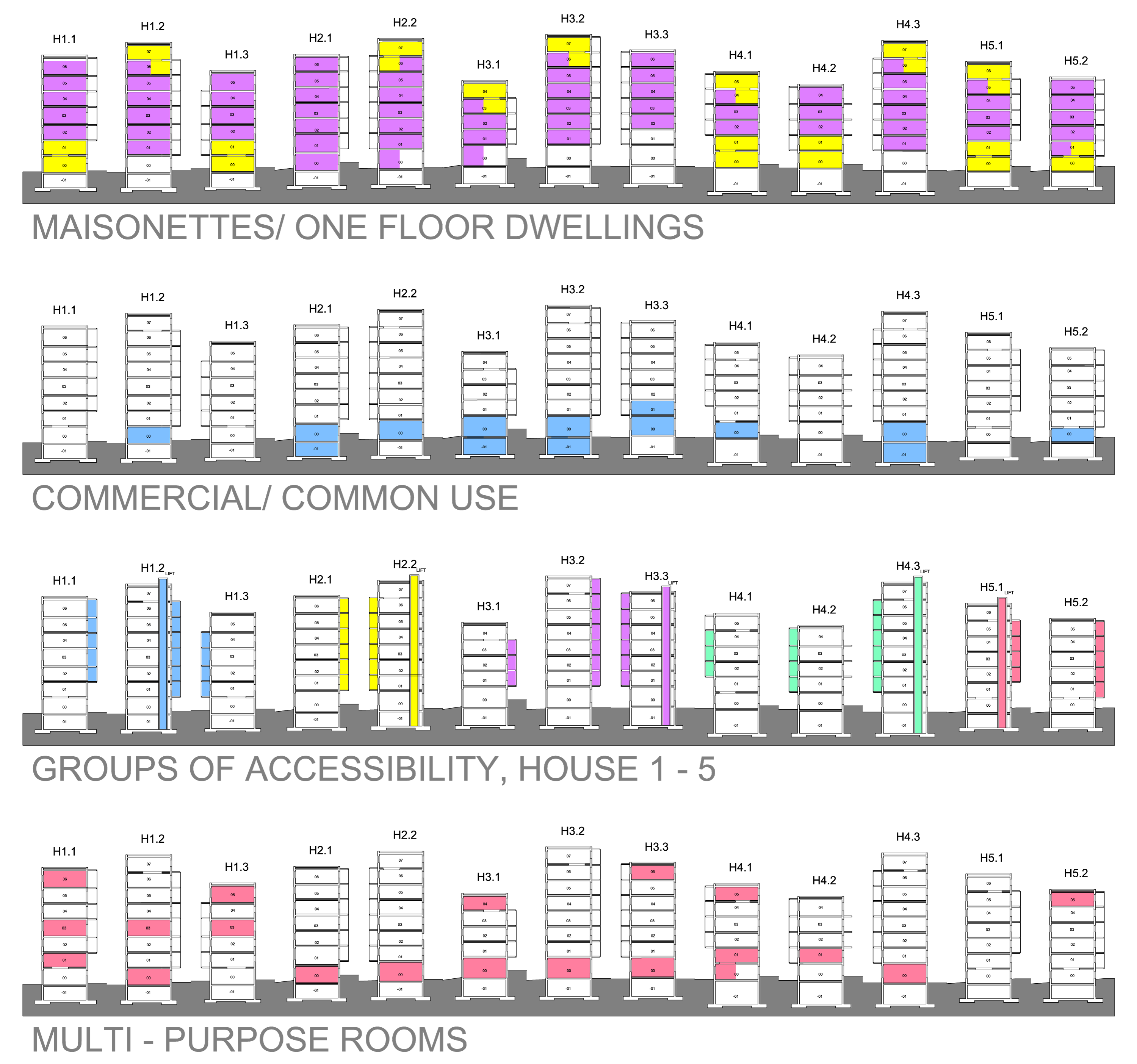
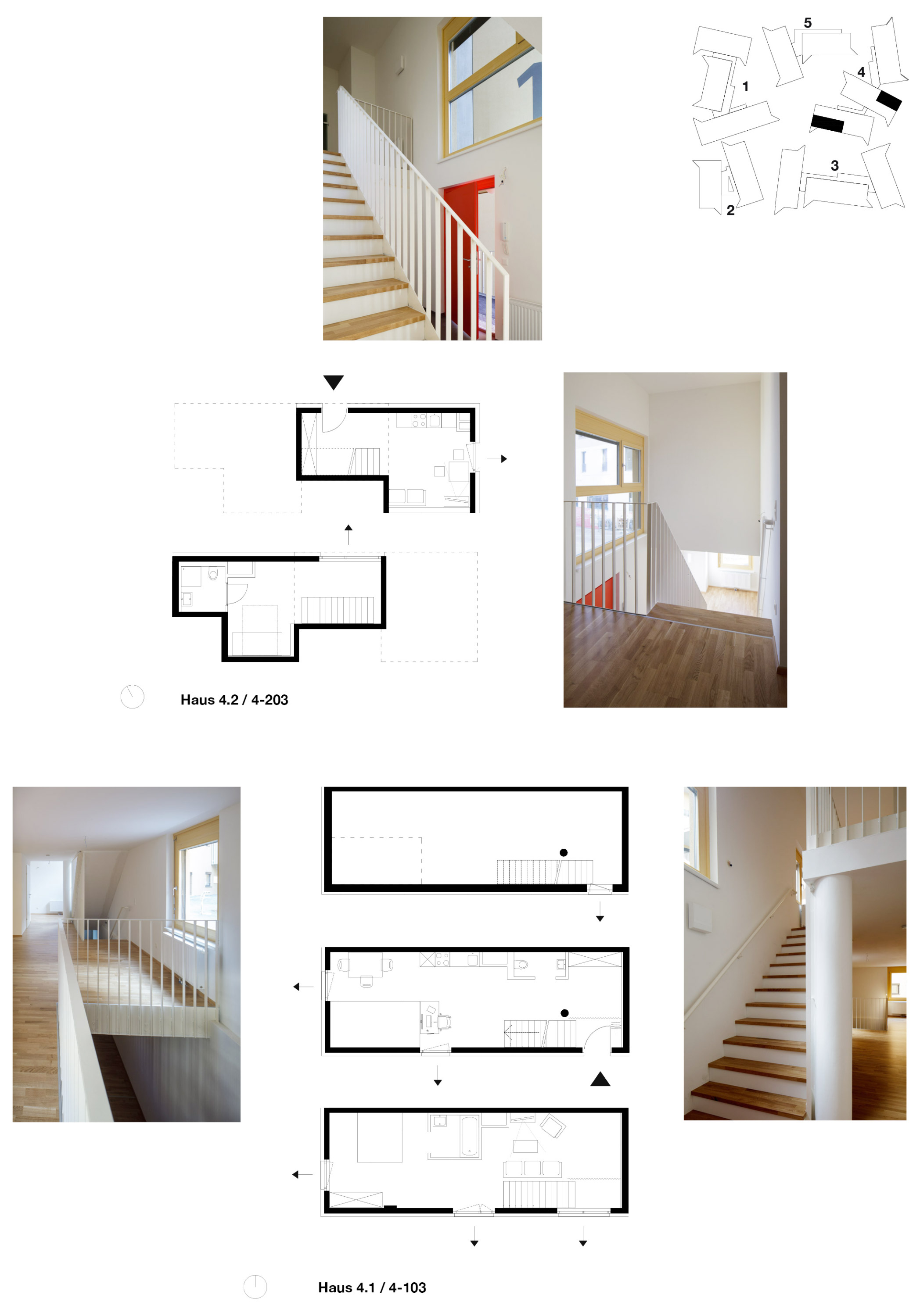
Vertical grammar In order to provide all dwellings with elevated living areas, we arranged the two lowest floors as maisonettes. In addition, we introduced maisonettes on both uppermost floors with the intention of reducing accessibility areas, except when an exterior elevated walkways may have been installed for other reasons. The units on the floors between the maisonettes on the two lowest floors (ground floor and first floor) and those on the two uppermost floors are standard apartments with one floor. Multi-purpose rooms (ceiling height >3m) required for functional mixed use were inserted into the overall structure in such a way to form coherent non-residential areas both on a lower and medium level. All of the open space in and around the complex is a playground and place for recreation. Activity zones invite children and youngsters to climb, run, slide and balance on them. Different kinds of walkways are ideal for venturing out with scooters, going for a run, biking, using inline skates, some other device or just walking. There are decentralised bicycle stands alongside the garden walls and directly near the five entrance areas. However: One cardinal error we have seen in residential housing development since the beginning of modern times is the mono-functionality of many new quarters, where life, as we know it from traditionally grown cities, may not turn out as desired. One of Seestadt Aspern’s greatest achievements is, therefore, to have realised mixed use from the start.
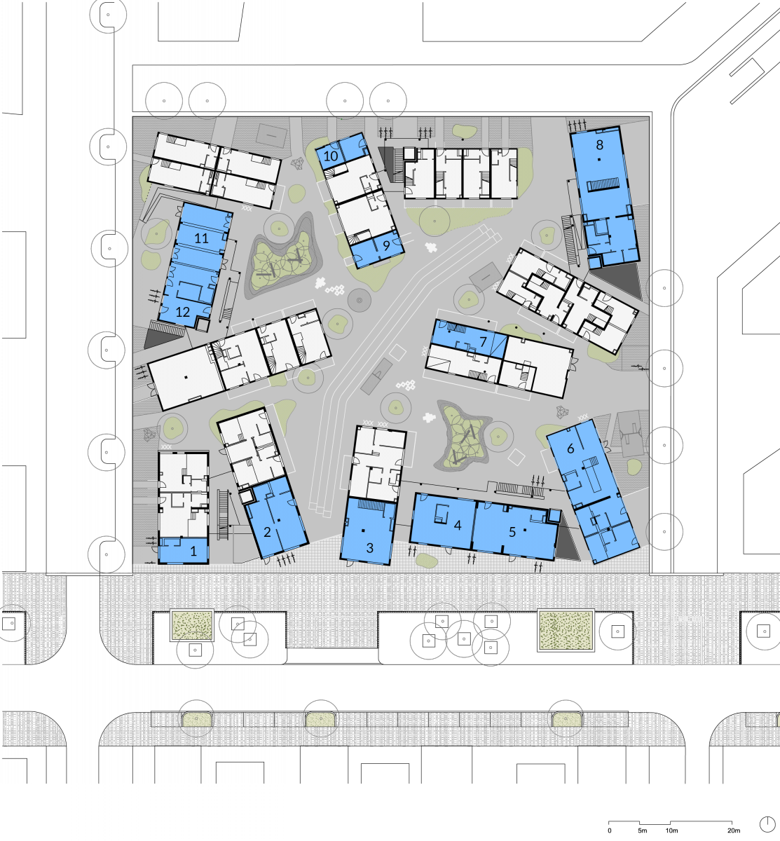
ground floor plan 1 candy store 2 vet 3 bicycle store 4 IT service 5 play group 6 SOS Kinsderdorf 7 cosmetics 8 café 9 rented office / learning aid 10 biscuit office 11 Slim City Center 12 facility management
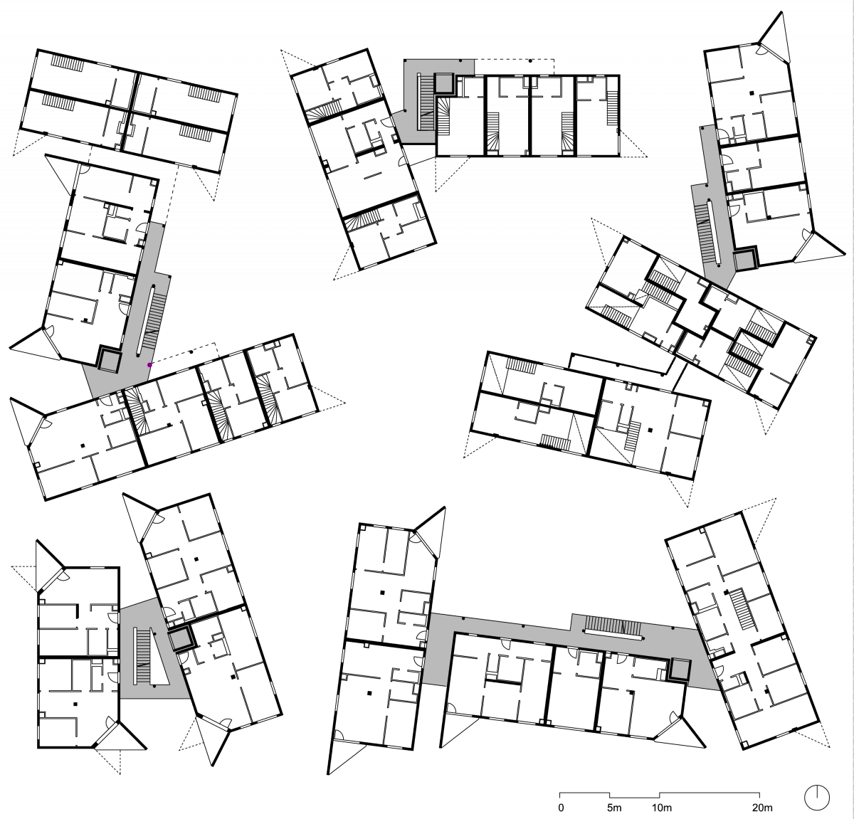
first floor plan
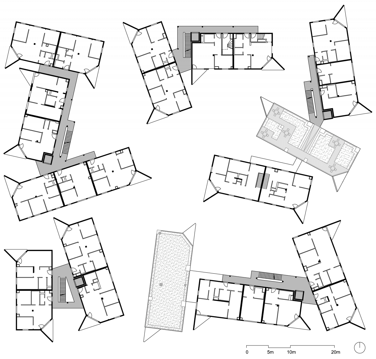
fifth floor plan
Photos and Video: Wolfgang Thaler
